実務で使える!初心者からプロまで役立つgulpの基本と応用ガイド
みなと
フロントエンドクリップ
Figma MCPサーバーって、実際に出てくるHTML/CSSはどのくらい使えるんだろう?
前編の記事では、Figma MCPサーバーとCursorを連携させ、セレクションベースでコードが出力されるところまでを確認しました。

前編では、Figma MCPサーバーが「動く」ことをゴールとしていたため、出力されるコードの中身については評価していません。そこで本記事(後編)では、「実際に生成されるHTML/CSSは、実務でどこまで使えるのか?」という点にフォーカスして検証していきます。
今回は、プロンプトの与え方を変えた2つのパターンでコード生成を行い、その結果を比較します。
この2つの検証において、以下の点を重視しています。
条件を揃えたうえで、プロンプトの与え方だけを変えた場合に、結果がどう変わるのかを確認します。
それではまず、今回の検証に使ったデモと比較用コードについて整理していきます。
ここでは、今回の検証に使用するデモと、比較の基準として用意したコードについて整理します。
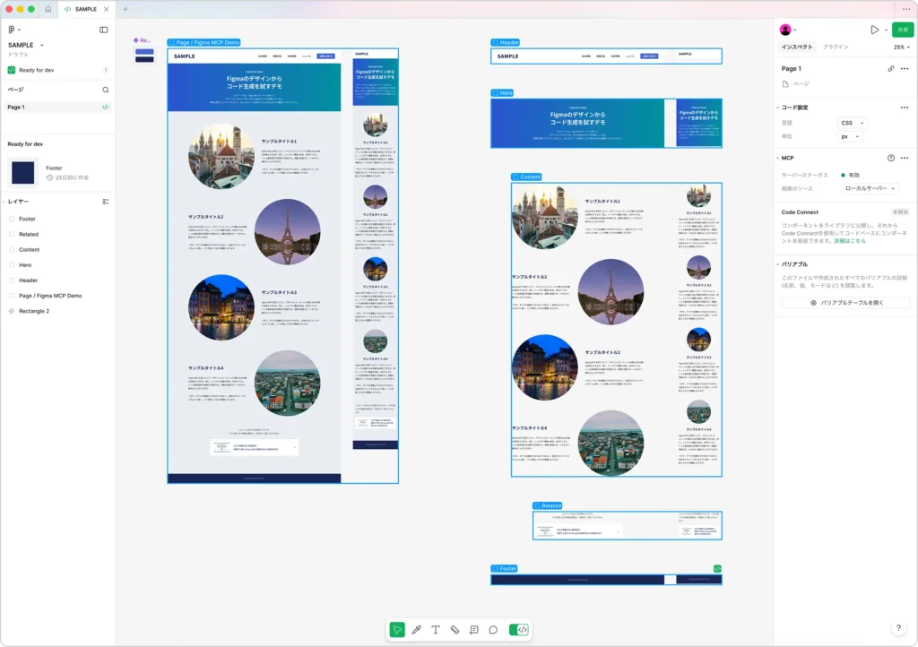
まずは、Figmaで用意したデザインカンプについてです。
今回の検証では、実務を想定したシンプルなLP構成のデザインカンプを使用しています。PC(1440px)とスマホ(375px)の両デザインを用意し、ページ全体の構成が確認できる形になっています。
また、ページ全体のデザインとは別に、各セクションごとにPC・スマホを含んだコンポーネントも用意しています。以下は、今回使用しているFigmaデザインの全体像です。
たとえばヒーローセクションの場合、
という構成になっています。このような構造にしておくことで、ページ全体だけでなく、セクション単位でPC・スマホ両方を含めた選択が可能になります。
後半では、このセクション単位のコンポーネントを使って、段階的にレスポンシブ対応したコード生成を試します。
なお、Figma上の構造はあえて最適化していません。実務では、常に整理されたカンプが渡ってくるとは限らないため、今回は「よくある状態」に近い前提で検証します。
次に、このデザインカンプをもとに、手動でHTMLとCSSを実装しました。以下のリンクから、実際のデモページを確認できます。
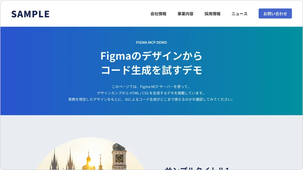
このページの見た目を、今回の検証における一つの基準として扱います。Figma MCPサーバーで生成されたHTML/CSSは、見た目の再現度だけでなく、HTML構造やレスポンシブの考え方、保守性といった観点も含めて、この手動コーディングの結果と比較しながら確認していきます。
また、このデモページで使用しているHTMLとCSSの全体コードも、以下にそのまま掲載しています。検証①・検証②では、生成されたコードを一切改変せず、この基準コードとどのような違いがあるのかを見ていきます。
以下は、デモページで使用しているHTMLです。Figmaのデザインをもとに、構造が分かりやすくなるよう、セクションごとにシンプルなマークアップを行っています。
<!DOCTYPE html>
<html lang="ja">
  <head>
    <meta charset="utf-8">
    <meta name="viewport" content="width=device-width, initial-scale=1">
    <meta name="format-detection" content="telephone=no">
    <title>Figma MCP サーバー</title>
    <link rel="stylesheet" href="css/style.css">
  </head>
  <body>
    <div class="wrapper">
      <header class="header">
        <div class="header-logo"><a href="#">SAMPLE</a></div>
        <nav class="header-nav">
          <ul>
            <li><a href="#">会社情報</a></li>
            <li><a href="#">事業内容</a></li>
            <li><a href="#">採用情報</a></li>
            <li><a href="#">ニュース</a></li>
          </ul>
        </nav>
        <div class="header-contact"><a href="#">お問い合わせ</a></div>
      </header>
      <div class="keyvisual">
        <p class="keyvisual-sub">FIGMA MCP DEMO</p>
        <h1>Figmaのデザインから<br>コード生成を試すデモ</h1>
        <p class="keyvisual-text">このページでは、Figma MCP サーバーを使って、<br class="only-pc">デザインカンプから HTML / CSS を生成するデモを掲載しています。<br class="only-pc">実務を想定したデザインをもとに、AIによるコード生成がどこまで使えるのかを確認してみてください。</p>
      </div>
      <div class="contents">
        <div class="section-wrap">
          <section class="section">
            <div class="section-image"><span><img src="pic_5138_demo01.webp" alt="サンプル画像1"></span></div>
            <div class="section-text">
              <h2>サンプルタイトル1</h2>
              <p>Figma MCP を使うことで、デザインとコーディングの間にある作業を効率化できます。特に、レイアウト構造や余白、文字サイズといった基本設計を把握する用途では、初動の実装スピードを大きく縮めることができます。</p>
              <p>一方で、すべてを自動化できるわけではなく、生成されたコードをどのように使い、どう手直しするかが重要になります。</p>
            </div>
          </section>
          <section class="section"><!-- 同じ構造のsection(省略) --></section>
          <section class="section"><!-- 同じ構造のsection(省略) --></section>
          <section class="section"><!-- 同じ構造のsection(省略) --></section>
        </div>
        <div class="notice">
          <p class="notice-text">このページは以下の記事のデモです。<br class="only-pc">デモの使い方や詳細な解説は、記事内でご覧いただけます。</p>
          <div class="notice-link">
            <a href="">
              <div class="notice-link-image"><span><img src="pic_eyecatch1228-320x180.webp" alt=""></span></div>
              <p class="notice-link-text">CSSで複雑な形も簡単設定!<br class="only-pc">実務でも使えるclip-pathの基本形状と応用例を紹介</p>
            </a>
          </div>
        </div>
      </div>
      <footer class="footer">
        <p class="footer-copy"><small>©フロントエンドクリップ</small></p>
      </footer>
    </div>
  </body>
</html>
以下は、デモページで使用しているCSSです。PCとスマホの両方に対応しつつ、実務で扱いやすい書き方を意識しています。
@import url('https://fonts.googleapis.com/css2?family=Noto+Sans+JP:wght@100..900&family=Roboto:wdth,wght@75,100..900&display=swap');

* {
  margin: 0;
  padding: 0;
}

@media (min-width: 768px) {
  br.only-sp {
    display: none;
  }
}

@media (max-width: 767px) {
  br.only-pc {
    display: none;
  }
}

ol,
ul {
  list-style: none;
}

a {
  color: inherit;
  text-decoration: none;
}

small {
  font-size: inherit;
}

html {
  overflow-y: scroll;
}

body {
  background: #e9edf2;
  color: #333;
  font-family: "Noto Sans JP", sans-serif;
  font-optical-sizing: auto;
  font-weight: 400;
  font-style: normal;
  line-height: 1.8;
  text-align: left;
  -webkit-font-smoothing: antialiased;
  -moz-osx-font-smoothing: grayscale;
  -webkit-text-size-adjust: none;
}

.wrapper {
  position: relative;
}

@media (min-width: 768px) {
  .wrapper {
    min-width: 1200px;
  }
}

.header {
  position: relative;
  background: #fff;
}

@media (min-width: 768px) {
  .header {
    height: 120px;
  }
}

@media (max-width: 767px) {
  .header {
    height: 80px;
  }
}

.header-logo {
  position: absolute;
  top: 50%;
  font-weight: 900;
  line-height: 1;
  transform: translateY(-50%);
}

@media (min-width: 768px) {
  .header-logo {
    left: 50px;
    font-size: 40px;
    letter-spacing: 2px;
  }
}

@media (max-width: 767px) {
  .header-logo {
    left: 20px;
    font-size: 25px;
    letter-spacing: 1px;
  }
}

.header-logo a {
  display: inline-block;
  color: #192753;
  text-decoration: none;
  vertical-align: top;
}

.header-nav {
  position: absolute;
  right: 240px;
  top: 50%;
  transform: translateY(-50%);
}

@media (max-width: 767px) {
  .header-nav {
    display: none;
  }
}

.header-nav ul {
  list-style: none;
  display: flex;
  gap: 0 30px;
}

.header-nav ul li a {
  display: block;
  padding: 10px;
  color: inherit;
  font-size: 18px;
  font-weight: 700;
  line-height: 1.4;
  text-decoration: none;
  transition: color 400ms;
}

.header-nav ul li a:hover {
  color: #4466ce;
}

.header-contact {
  position: absolute;
  right: 50px;
  top: 50%;
  transform: translateY(-50%);
}

@media (max-width: 767px) {
  .header-contact {
    display: none;
  }
}

.header-contact a {
  display: block;
  width: 150px;
  padding: 10px 0;
  border-radius: 5px;
  background: #4466ce;
  color: #fff;
  font-size: 18px;
  font-weight: 700;
  line-height: 1.4;
  text-align: center;
  text-decoration: none;
  transition: background-color 400ms;
}

.header-contact a:hover {
  background: #192753;
}

.keyvisual {
  display: flex;
  flex-direction: column;
  justify-content: center;
  align-items: center;
  position: relative;
  background: linear-gradient(90deg, #2A53D0, #00909E);
  color: #fff;
}

@media (min-width: 768px) {
  .keyvisual {
    height: 400px;
  }
}

@media (max-width: 767px) {
  .keyvisual {
    padding: 60px 0;
  }
}

.keyvisual-sub {
  position: relative;
  font-weight: 700;
  line-height: 1.5;
  text-align: center;
}

@media (min-width: 768px) {
  .keyvisual-sub {
    margin-bottom: 15px;
    font-size: 16px;
  }
}

@media (max-width: 767px) {
  .keyvisual-sub {
    margin-bottom: 10px;
    font-size: 14px;
  }
}

.keyvisual h1 {
  position: relative;
  font-weight: 700;
  line-height: 1.4;
  text-align: center;
}

@media (min-width: 768px) {
  .keyvisual h1 {
    font-size: 46px;
  }
}

@media (max-width: 767px) {
  .keyvisual h1 {
    font-size: 32px;
  }
}

.keyvisual-text {
  position: relative;
}

@media (min-width: 768px) {
  .keyvisual-text {
    margin-top: 30px;
    font-size: 16px;
    line-height: 1.8;
    text-align: center;
  }
}

@media (max-width: 767px) {
  .keyvisual-text {
    margin: 30px 20px 0;
    font-size: 14px;
  }
}

@media (min-width: 768px) {
  .contents {
    width: 1100px;
    margin: 0 auto;
    padding: 100px 0 150px;
  }
}

@media (max-width: 767px) {
  .contents {
    margin: 0 20px;
    padding: 60px 0 100px;
  }
}

@media (min-width: 768px) {
  .section {
    display: flex;
    align-items: center;
  }
}

@media (min-width: 768px) {
  .section-image {
    width: 50%;
  }
}

@media (max-width: 767px) {
  .section-image {
    width: 200px;
    margin: 0 auto;
  }
}

.section-image span {
  display: block;
  position: relative;
  aspect-ratio: 1;
  overflow: hidden;
  clip-path: circle(50%);
}

.section-image img {
  display: block;
  position: absolute;
  left: 0;
  top: 0;
  width: 100%;
  height: 100%;
  border-radius: 50%;
  object-fit: cover;
}

.section-text {
  box-sizing: border-box;
}

@media (min-width: 768px) {
  .section-text {
    width: 50%;
  }
}

@media (max-width: 767px) {
  .section-text {
    margin-top: 30px;
  }
}

.section-text h2 {
  color: #192753;
  font-weight: 700;
  line-height: 1.4;
}

@media (min-width: 768px) {
  .section-text h2 {
    margin-bottom: 45px;
    font-size: 34px;
  }
}

@media (max-width: 767px) {
  .section-text h2 {
    margin-bottom: 20px;
    font-size: 24px;
    text-align: center;
  }
}

@media (min-width: 768px) {
  .section-text p + p {
    margin-top: 35px;
  }
}

@media (max-width: 767px) {
  .section-text p + p {
    margin-top: 25px;
  }
}

@media (min-width: 768px) {
  .section:nth-child(n+2) {
    margin-top: 80px;
  }
}

@media (max-width: 767px) {
  .section:nth-child(n+2) {
    margin-top: 60px;
  }
}

@media (min-width: 768px) {
  .section:nth-child(2n+1) {
    flex-direction: row;
  }

  .section:nth-child(2n+1) .section-text {
    padding-left: 60px;
  }

  .section:nth-child(2n+2) {
    flex-direction: row-reverse;
  }

  .section:nth-child(2n+2) .section-text {
    padding-right: 60px;
  }
}

@media (min-width: 768px) {
  .notice {
    width: 740px;
    margin: 100px auto 0;
  }
}

@media (max-width: 767px) {
  .notice {
    margin-top: 80px;
  }
}

@media (min-width: 768px) {
  .notice-text {
    margin-bottom: 35px;
    text-align: center;
  }
}

@media (max-width: 767px) {
  .notice-text {
    margin-bottom: 25px;
  }
}

@media (min-width: 768px) {
  .notice-link-image {
    width: 20%;
  }
}

@media (max-width: 767px) {
  .notice-link-image {
    width: 30%;
  }
}

.notice-link-image span {
  display: block;
  position: relative;
  aspect-ratio: 320 / 180;
  overflow: hidden;
}

.notice-link-image img {
  display: block;
  position: absolute;
  left: 0;
  top: 0;
  width: 100%;
  height: 100%;
  border-radius: 5px;
  object-fit: cover;
}

.notice-link-text {
  box-sizing: border-box;
  font-weight: 500;
}

@media (min-width: 768px) {
  .notice-link-text {
    width: 80%;
    padding-left: 30px;
  }
}

@media (max-width: 767px) {
  .notice-link-text {
    width: 70%;
    padding-left: 20px;
    font-size: 14px;
    line-height: 1.6;
  }
}

.notice-link a {
  display: flex;
  align-items: center;
  position: relative;
  border-radius: 5px;
  background: #fff;
  color: #192753;
  text-decoration: none;
  transition: transform 400ms;
}

@media (min-width: 768px) {
  .notice-link a {
    padding: 30px;
  }
}

@media (max-width: 767px) {
  .notice-link a {
    padding: 15px 20px;
  }
}

@media (min-width: 768px) {
  .notice-link a::before {
    content: "";
    display: block;
    position: absolute;
    right: 30px;
    top: 50%;
    width: 10px;
    height: 10px;
    margin-top: -5px;
    box-sizing: border-box;
    border-top: 3px solid #4466ce;
    border-right: 3px solid #4466ce;
    transform: rotate(45deg);
  }
}

@media (min-width: 768px) {
  .notice-link a:hover {
    transform: translateY(-6px);
  }
}

.footer {
  background: #192753;
  color: #fff;
}

@media (min-width: 768px) {
  .footer {
    padding: 30px 0;
  }
}

@media (max-width: 767px) {
  .footer {
    padding: 25px 0;
  }
}

.footer-copy {
  font-size: 14px;
  text-align: center;
}
まずは、最小プロンプトでページ全体を一括生成した場合の結果を見ていきます。この検証では、Figma MCPサーバーに対して、ほぼ指示を与えていません。実際に使用したプロンプトは、以下のとおりです。
/figma-desktop/get_code_for_selection
HTMLとCSSを生成してください
選択したのは、ページ全体のPC・スマホデザインを含むフレームです。いわゆる「とりあえず投げたらどうなるか」を確認するための検証になります。
以下が、最小プロンプトで一括生成されたHTML/CSSを使ったデモページです。
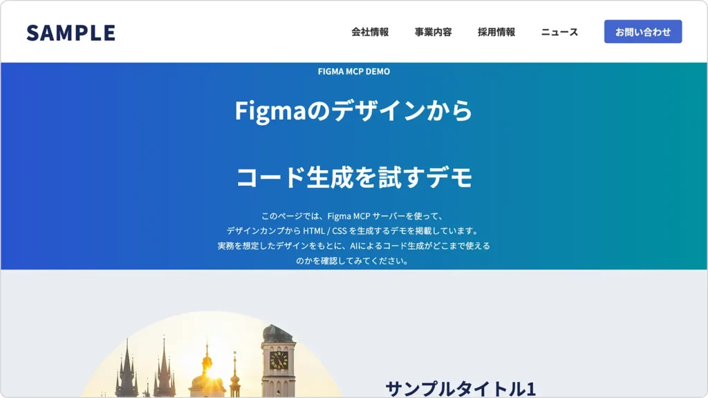
デザインカンプの内容は一通り反映されているようにも見えますが、ぱっと見ただけでも、違和感のある部分や気になる点がいくつか目に入ります。
以下は、最小プロンプトでページ全体を一括生成した際に出力されたHTMLとCSSです。基本的には、出力されたコードを改変せず、そのまま掲載しています。画像パスのみ、このブログのデモページで表示できるように変更しています。
以下は、生成されたHTMLです。PC用・スマホ用の構造がそれぞれ出力されている点など、生成結果の特徴を確認できます。
<!DOCTYPE html>
<html lang="ja">
<head>
    <meta charset="UTF-8">
    <meta name="viewport" content="width=device-width, initial-scale=1.0">
    <title>Figma MCP Demo</title>
    <link rel="stylesheet" href="styles.css">
    <link rel="preconnect" href="https://fonts.googleapis.com">
    <link rel="preconnect" href="https://fonts.gstatic.com" crossorigin>
    <link href="https://fonts.googleapis.com/css2?family=Noto+Sans+JP:wght@400;500;700;900&display=swap" rel="stylesheet">
</head>
<body>
    <!-- Header Desktop -->
    <header class="header-desktop">
        <h1 class="header-logo">SAMPLE</h1>
        <nav class="header-nav">
            <ul class="nav-list">
                <li><a href="#">会社情報</a></li>
                <li><a href="#">事業内容</a></li>
                <li><a href="#">採用情報</a></li>
                <li><a href="#">ニュース</a></li>
            </ul>
            <button class="contact-btn">お問い合わせ</button>
        </nav>
    </header>

    <!-- Header Mobile -->
    <header class="header-mobile">
        <h1 class="header-logo">SAMPLE</h1>
    </header>

    <!-- Hero Desktop -->
    <section class="hero-desktop">
        <div class="hero-content">
            <p class="hero-label">FIGMA MCP DEMO</p>
            <h2 class="hero-title">
                <span>Figmaのデザインから</span><br>
                <span>コード生成を試すデモ</span>
            </h2>
            <p class="hero-description">
                このページでは、Figma MCP サーバーを使って、<br>
                デザインカンプから HTML / CSS を生成するデモを掲載しています。<br>
                実務を想定したデザインをもとに、AIによるコード生成がどこまで使えるのかを確認してみてください。
            </p>
        </div>
    </section>

    <!-- Hero Mobile -->
    <section class="hero-mobile">
        <div class="hero-content">
            <p class="hero-label">FIGMA MCP DEMO</p>
            <h2 class="hero-title">
                <span>Figmaのデザインから</span><br>
                <span>コード生成を試すデモ</span>
            </h2>
            <p class="hero-description">
                このページでは、Figma MCP サーバーを使って、<br>
                デザインカンプから HTML / CSS を生成するデモを掲載しています。実務を想定したデザインをもとに、AIによるコード生成がどこまで使えるのかを確認してみてください。
            </p>
        </div>
    </section>

    <!-- Content Desktop -->
    <section class="content-desktop">
        <!-- Content Item 1 -->
        <div class="content-item">
            <div class="content-image">
                <img src="pic_5138_demo01.webp" alt="サンプル画像1">
            </div>
            <div class="content-text">
                <h3 class="content-title">サンプルタイトル1</h3>
                <div class="content-description">
                    <p>Figma MCP を使うことで、デザインとコーディングの間にある作業を効率化できます。特に、レイアウト構造や余白、文字サイズといった基本設計を把握する用途では、初動の実装スピードを大きく縮めることができます。</p>
                    <p>一方で、すべてを自動化できるわけではなく、生成されたコードをどのように使い、どう手直しするかが重要になります。</p>
                </div>
            </div>
        </div>

        <!-- Content Item 2 -->
        <div class="content-item content-item-reverse">
            <div class="content-text">
                <h3 class="content-title">サンプルタイトル2</h3>
                <div class="content-description">
                    <p>Figma MCP を使うことで、デザインとコーディングの間にある作業を効率化できます。特に、レイアウト構造や余白、文字サイズといった基本設計を把握する用途では、初動の実装スピードを大きく縮めることができます。</p>
                    <p>一方で、すべてを自動化できるわけではなく、生成されたコードをどのように使い、どう手直しするかが重要になります。</p>
                </div>
            </div>
            <div class="content-image">
                <img src="pic_5138_demo02.webp" alt="サンプル画像2">
            </div>
        </div>

        <!-- Content Item 3 -->
        <div class="content-item">
            <div class="content-image">
                <img src="pic_5138_demo03.webp" alt="サンプル画像3">
            </div>
            <div class="content-text">
                <h3 class="content-title">サンプルタイトル3</h3>
                <div class="content-description">
                    <p>Figma MCP を使うことで、デザインとコーディングの間にある作業を効率化できます。特に、レイアウト構造や余白、文字サイズといった基本設計を把握する用途では、初動の実装スピードを大きく縮めることができます。</p>
                    <p>一方で、すべてを自動化できるわけではなく、生成されたコードをどのように使い、どう手直しするかが重要になります。</p>
                </div>
            </div>
        </div>

        <!-- Content Item 4 -->
        <div class="content-item content-item-reverse">
            <div class="content-text">
                <h3 class="content-title">サンプルタイトル4</h3>
                <div class="content-description">
                    <p>Figma MCP を使うことで、デザインとコーディングの間にある作業を効率化できます。特に、レイアウト構造や余白、文字サイズといった基本設計を把握する用途では、初動の実装スピードを大きく縮めることができます。</p>
                    <p>一方で、すべてを自動化できるわけではなく、生成されたコードをどのように使い、どう手直しするかが重要になります。</p>
                </div>
            </div>
            <div class="content-image">
                <img src="pic_5138_demo04.webp" alt="サンプル画像4">
            </div>
        </div>
    </section>

    <!-- Content Mobile -->
    <section class="content-mobile">
        <!-- Content Item 1 -->
        <div class="content-item-mobile">
            <div class="content-image-mobile">
                <img src="pic_5138_demo01.webp" alt="サンプル画像1">
            </div>
            <div class="content-text-mobile">
                <h3 class="content-title-mobile">サンプルタイトル1</h3>
                <div class="content-description-mobile">
                    <p>Figma MCP を使うことで、デザインとコーディングの間にある作業を効率化できます。特に、レイアウト構造や余白、文字サイズといった基本設計を把握する用途では、初動の実装スピードを大きく縮めることができます。</p>
                    <p>一方で、すべてを自動化できるわけではなく、生成されたコードをどのように使い、どう手直しするかが重要になります。</p>
                </div>
            </div>
        </div>

        <!-- Content Item 2 -->
        <div class="content-item-mobile">
            <div class="content-image-mobile">
                <img src="pic_5138_demo02.webp" alt="サンプル画像2">
            </div>
            <div class="content-text-mobile">
                <h3 class="content-title-mobile">サンプルタイトル2</h3>
                <div class="content-description-mobile">
                    <p>Figma MCP を使うことで、デザインとコーディングの間にある作業を効率化できます。特に、レイアウト構造や余白、文字サイズといった基本設計を把握する用途では、初動の実装スピードを大きく縮めることができます。</p>
                    <p>一方で、すべてを自動化できるわけではなく、生成されたコードをどのように使い、どう手直しするかが重要になります。</p>
                </div>
            </div>
        </div>

        <!-- Content Item 3 -->
        <div class="content-item-mobile">
            <div class="content-image-mobile">
                <img src="pic_5138_demo03.webp" alt="サンプル画像3">
            </div>
            <div class="content-text-mobile">
                <h3 class="content-title-mobile">サンプルタイトル3</h3>
                <div class="content-description-mobile">
                    <p>Figma MCP を使うことで、デザインとコーディングの間にある作業を効率化できます。特に、レイアウト構造や余白、文字サイズといった基本設計を把握する用途では、初動の実装スピードを大きく縮めることができます。</p>
                    <p>一方で、すべてを自動化できるわけではなく、生成されたコードをどのように使い、どう手直しするかが重要になります。</p>
                </div>
            </div>
        </div>

        <!-- Content Item 4 -->
        <div class="content-item-mobile">
            <div class="content-image-mobile">
                <img src="pic_5138_demo04.webp" alt="サンプル画像4">
            </div>
            <div class="content-text-mobile">
                <h3 class="content-title-mobile">サンプルタイトル4</h3>
                <div class="content-description-mobile">
                    <p>Figma MCP を使うことで、デザインとコーディングの間にある作業を効率化できます。特に、レイアウト構造や余白、文字サイズといった基本設計を把握する用途では、初動の実装スピードを大きく縮めることができます。</p>
                    <p>一方で、すべてを自動化できるわけではなく、生成されたコードをどのように使い、どう手直しするかが重要になります。</p>
                </div>
            </div>
        </div>
    </section>

    <!-- Related Desktop -->
    <section class="related-desktop">
        <p class="related-text">
            このページは以下の記事のデモです。<br>
            デモの使い方や詳細な解説は、記事内でご覧いただけます。
        </p>
        <div class="related-card">
            <div class="related-card-image">
                <img src="pic_eyecatch1228-320x180.webp" alt="関連記事">
            </div>
            <div class="related-card-content">
                <p class="related-card-text">
                    CSSで複雑な形も簡単設定!<br>
                    実務でも使えるclip-pathの基本形状と応用例を紹介
                </p>
                <div class="related-card-arrow">
                    <img src="icon_5138_demo01.svg" alt="矢印">
                </div>
            </div>
        </div>
    </section>

    <!-- Related Mobile -->
    <section class="related-mobile">
        <p class="related-text">
            このページは以下の記事のデモです。デモの使い方や詳細な解説は、記事内でご覧いただけます。
        </p>
        <div class="related-card">
            <div class="related-card-image">
                <img src="pic_eyecatch1228-320x180.webp" alt="関連記事">
            </div>
            <p class="related-card-text">
                CSSで複雑な形も簡単設定!実務でも使えるclip-pathの基本形状と応用例を紹介
            </p>
        </div>
    </section>

    <!-- Footer Desktop -->
    <footer class="footer-desktop">
        <p class="footer-text">©フロントエンドクリップ</p>
    </footer>

    <!-- Footer Mobile -->
    <footer class="footer-mobile">
        <p class="footer-text">©フロントエンドクリップ</p>
    </footer>
</body>
</html>
以下は、上記HTMLに対応するCSSです。レイアウトや余白の指定方法など、FigmaのデザインがどのようにCSSへ落とし込まれているかを確認できます。
/* リセットとベーススタイル */
* {
    margin: 0;
    padding: 0;
    box-sizing: border-box;
}

body {
    font-family: 'Noto Sans JP', sans-serif;
    background-color: #e9edf2;
    color: #333;
    line-height: 1.6;
}

img {
    max-width: 100%;
    height: auto;
    display: block;
}

a {
    text-decoration: none;
    color: inherit;
}

button {
    border: none;
    background: none;
    cursor: pointer;
    font-family: inherit;
}

/* Header Desktop */
.header-desktop {
    background-color: #fff;
    height: 120px;
    padding: 36px 50px;
    align-items: center;
    justify-content: space-between;
}

.header-logo {
    font-family: 'Noto Sans JP', sans-serif;
    font-weight: 900;
    font-size: 40px;
    color: #192753;
    letter-spacing: 2px;
    line-height: normal;
}

.header-nav {
    display: flex;
    align-items: center;
    gap: 50px;
}

.nav-list {
    display: flex;
    list-style: none;
    gap: 50px;
    align-items: center;
}

.nav-list a {
    font-family: 'Noto Sans JP', sans-serif;
    font-weight: 700;
    font-size: 18px;
    color: #333;
    line-height: normal;
}

.contact-btn {
    width: 150px;
    height: 45px;
    background-color: #4466ce;
    border-radius: 5px;
    color: #fff;
    font-family: 'Noto Sans JP', sans-serif;
    font-weight: 700;
    font-size: 18px;
    display: flex;
    align-items: center;
    justify-content: center;
    line-height: normal;
}

/* Header Mobile */
.header-mobile {
    background-color: #fff;
    height: 80px;
    padding: 36px 20px;
    align-items: center;
}

/* Hero Desktop */
.hero-desktop {
    background: linear-gradient(to right, #2a53d0, #00909e);
    height: 400px;
    padding: 0 417px;
    flex-direction: column;
    align-items: center;
    justify-content: center;
    text-align: center;
    color: #fff;
}

.hero-content {
    display: flex;
    flex-direction: column;
    gap: 30px;
    align-items: center;
}

.hero-label {
    font-family: 'Noto Sans JP', sans-serif;
    font-weight: 700;
    font-size: 16px;
    line-height: normal;
}

.hero-title {
    font-family: 'Noto Sans JP', sans-serif;
    font-weight: 700;
    font-size: 46px;
    line-height: 1.4;
}

.hero-title span {
    display: block;
}

.hero-description {
    font-family: 'Noto Sans JP', sans-serif;
    font-weight: 400;
    font-size: 16px;
    line-height: 1.8;
}

.hero-description p {
    margin: 0;
}

/* Hero Mobile */
.hero-mobile {
    background: linear-gradient(to right, #2a53d0, #00909e);
    padding: 60px 20px;
    flex-direction: column;
    gap: 30px;
    align-items: center;
    justify-content: center;
    text-align: center;
    color: #fff;
}

.hero-mobile .hero-label {
    font-size: 14px;
}

.hero-mobile .hero-title {
    font-size: 32px;
}

.hero-mobile .hero-description {
    font-size: 14px;
}

/* Content Desktop */
.content-desktop {
    max-width: 1100px;
    margin: 0 auto;
    padding: 80px 0;
    flex-direction: column;
    gap: 80px;
}

.content-item {
    display: flex;
    gap: 60px;
    align-items: center;
    justify-content: center;
}

.content-item-reverse {
    flex-direction: row-reverse;
}

.content-image {
    width: 550px;
    height: 550px;
    border-radius: 999px;
    overflow: hidden;
    flex-shrink: 0;
}

.content-image img {
    width: 100%;
    height: 100%;
    object-fit: cover;
}

.content-text {
    width: 490px;
    display: flex;
    flex-direction: column;
    gap: 45px;
}

.content-title {
    font-family: 'Noto Sans JP', sans-serif;
    font-weight: 700;
    font-size: 34px;
    line-height: 1.4;
    color: #192753;
    width: 100%;
}

.content-description {
    display: flex;
    flex-direction: column;
    gap: 35px;
    font-family: 'Noto Sans JP', sans-serif;
    font-weight: 400;
    font-size: 16px;
    line-height: 1.8;
    color: #000;
    width: 100%;
}

.content-description p {
    width: 100%;
}

/* Content Mobile */
.content-mobile {
    width: 100%;
    padding: 60px 20px;
    flex-direction: column;
    gap: 60px;
    align-items: center;
}

.content-item-mobile {
    width: 100%;
    display: flex;
    flex-direction: column;
    gap: 30px;
    align-items: center;
}

.content-image-mobile {
    width: 200px;
    height: 200px;
    border-radius: 999px;
    overflow: hidden;
    flex-shrink: 0;
}

.content-image-mobile img {
    width: 100%;
    height: 100%;
    object-fit: cover;
}

.content-text-mobile {
    width: 100%;
    display: flex;
    flex-direction: column;
    gap: 20px;
    align-items: center;
}

.content-title-mobile {
    font-family: 'Noto Sans JP', sans-serif;
    font-weight: 700;
    font-size: 24px;
    line-height: 1.4;
    color: #192753;
    text-align: center;
    width: 100%;
}

.content-description-mobile {
    width: 100%;
    display: flex;
    flex-direction: column;
    gap: 25px;
    font-family: 'Noto Sans JP', sans-serif;
    font-weight: 400;
    font-size: 16px;
    line-height: 1.8;
    color: #000;
}

.content-description-mobile p {
    width: 100%;
}

/* Related Desktop */
.related-desktop {
    max-width: 740px;
    margin: 0 auto;
    padding: 35px 0;
    flex-direction: column;
    gap: 35px;
    align-items: center;
    height: 225px;
}

.related-text {
    font-family: 'Noto Sans JP', sans-serif;
    font-weight: 400;
    font-size: 16px;
    line-height: 1.8;
    color: #333;
    text-align: center;
}

.related-card {
    background-color: #fff;
    width: 740px;
    padding: 30px;
    border-radius: 5px;
    display: flex;
    gap: 30px;
    align-items: center;
}

.related-card-image {
    width: 136px;
    height: 77px;
    border-radius: 5px;
    overflow: hidden;
    flex-shrink: 0;
}

.related-card-image img {
    width: 100%;
    height: 100%;
    object-fit: cover;
}

.related-card-content {
    flex: 1;
    display: flex;
    gap: 20px;
    align-items: center;
}

.related-card-text {
    flex: 1;
    font-family: 'Noto Sans JP', sans-serif;
    font-weight: 500;
    font-size: 16px;
    line-height: 1.8;
    color: #192757;
}

.related-card-arrow {
    width: 5px;
    height: 10px;
    flex-shrink: 0;
    display: flex;
    align-items: center;
    justify-content: center;
    transform: rotate(90deg) scaleY(-1);
}

.related-card-arrow img {
    width: 100%;
    height: 100%;
}

/* Related Mobile */
.related-mobile {
    width: 100%;
    padding: 25px 20px;
    flex-direction: column;
    gap: 25px;
    align-items: center;
}

.related-mobile .related-text {
    width: 100%;
    font-size: 16px;
}

.related-mobile .related-card {
    width: 100%;
    padding: 15px 20px;
    gap: 20px;
}

.related-mobile .related-card-image {
    width: 88.5px;
    height: 49.781px;
}

.related-mobile .related-card-text {
    font-size: 14px;
    line-height: 1.6;
}

.related-mobile .related-card-arrow {
    display: none;
}

/* Footer Desktop */
.footer-desktop {
    background-color: #192753;
    padding: 30px 0;
    flex-direction: column;
    align-items: center;
}

.footer-text {
    font-family: 'Noto Sans JP', sans-serif;
    font-weight: 400;
    font-size: 14px;
    line-height: normal;
    text-align: center;
    color: #fff;
    width: 100%;
}

/* Footer Mobile */
.footer-mobile {
    background-color: #192753;
    padding: 30px 20px 25px;
    width: 100%;
    flex-direction: column;
    align-items: center;
}

/* レスポンシブ対応 */
@media (min-width: 769px) {
    .header-desktop,
    .hero-desktop,
    .content-desktop,
    .related-desktop,
    .footer-desktop {
        display: flex;
    }

    .header-mobile,
    .hero-mobile,
    .content-mobile,
    .related-mobile,
    .footer-mobile {
        display: none;
    }
}

@media (max-width: 768px) {
    .header-mobile,
    .hero-mobile,
    .content-mobile,
    .related-mobile,
    .footer-mobile {
        display: flex;
    }

    .header-desktop,
    .hero-desktop,
    .content-desktop,
    .related-desktop,
    .footer-desktop {
        display: none;
    }

    .footer-desktop {
        width: 100%;
    }
}ここからは、生成されたHTML/CSSを実務で扱うことを前提に評価していきます。
生成されたHTMLでは、headerやhero、content、related、footerといった主要な構造がすべてPC用・スマホ用に分かれた形で出力されていました。表示の切り替えは、メディアクエリでdisplay: noneを使って行われています。
この構成では、同じ内容の修正をPC用・スマホ用それぞれに行う必要があり、修正漏れが起きやすくなります。
単一DOMをCSSで調整する一般的なレスポンシブ実装と比べると、継続的な運用には不向きかもしれないですね。
HTMLの見出し構造を確認すると、
h1h2h3という構成になっていました。ロゴをh1にするケース自体は珍しくありませんが、今回のデモのようにページ全体の主題が明確に存在する場合は、その内容を示す見出しをh1としたほうが、構造としては自然です。
ブラウザ幅を狭めていくと、ヒーローエリアの左右余白が極端に詰まり、見出しや説明文が不自然に折り返されるなど、分かりやすい崩れが発生します。
CSSを見ると、ヒーローエリアにpadding: 0 417pxが指定されており、画面幅が変わることをほとんど想定していないレイアウトになっていることが分かります。
また、ヒーロー以外のセクションでも、画像サイズやテキスト幅が固定pxで指定されている箇所が多く、Figma上のサイズをそのままCSSに落とし込んだようなスタイルが全体的に見られました。
こうした固定px前提のレイアウトだと、画面サイズが少し変わるだけでも崩れやすく、実務で扱うには少し厳しそうですね。
デモページを見ると、すべてのセクションで「画像が左・文章が右」という同じ並びになっています。
コードを確認すると、HTML側ではすでにセクションごとに要素の並び順を入れ替えています。たとえば、通常のセクションと、反転用クラスが付いたセクションでは、要素の並びが以下のように異なっています。
<div class="content-item">
  <!-- 通常並び:画像 → テキスト -->
  <div class="content-image">...</div>
  <div class="content-text">...</div>
</div>

<div class="content-item content-item-reverse">
  <!-- 交互レイアウト用:HTML側で並びを反転 -->
  <div class="content-text">...</div>
  <div class="content-image">...</div>
</div>
この状態で、CSS側でもflex-direction: row-reverseを使って反転させているため、結果として反転が二重にかかり、すべてのセクションが同じ並びになっていました。本来意図していた交互レイアウトが成立していない状態です。
他にも、細かい点ですが、
<button>になっているfont-familyやline-height: normalなど不要な指定が要素ごとに繰り返されているなど、実務でそのまま使うには気になる点が複数見られました。
最小プロンプトでページ全体を一括生成した場合、今回の検証からは次のような結果になりました。
デザインがかなりシンプルで、「とりあえず全体像を確認したい」用途なら使える場面もありそうですね。
検証①では、最小プロンプトでページ全体を一括生成した結果、実務前提としては厳しいコードが出力されました。
そこで今回は、スケルトン(ページ全体の骨組み)生成後に各セクションをパーツ単位で生成する、段階的な方法を試しました。Figma MCPを意図的に使った場合、出力品質がどこまで改善するか確認してみましょう。
検証②では、ページ全体を一括で生成するのではなく、スケルトンを土台にして、各セクションを段階的に生成していく方法を試しました。以下では、その具体的な手順を順に見ていきます。
最初に、ページ全体の構造だけを持つスケルトンを生成しました。完成コードを作るのではなく、後から各パーツを差し替えるための土台を用意するのが目的です。ここでは、Figmaカンプ左側のページ全体フレームを選択したうえで、以下のプロンプトを実行しています。
/figma-desktop/get_code_for_selection

選択範囲をもとに、ページ全体の「スケルトン」だけを生成してください。
完成コードは不要です。スケルトンの目的は、後からパーツ単位で差し替える土台を作ることです。

必須条件(重要):
- 出力はプレーンなHTMLとCSSのみ(プリプロセッサ禁止)
- JavaScriptは出力しない
- HTMLは「骨格のみ」にしてください:
  - head要素(meta / title / font読み込み / CSS読み込み)
  - body内は header / main / footer の枠だけ
  - main内の各セクションは空のプレースホルダーにしてください(中身は書かない)
    例)<section class="hero"><!-- placeholder --></section>
- CSSは「共通ベースのみ」にしてください:
  - bodyの背景色、フォント、基本line-height
  - 画像・リンク・リストの最低限のベース
  - コンテナ幅(max-width + padding-inline)
  - セクション共通の余白(padding-block)
- 個別パーツの詳細CSS(hero/content/article等の作り込み)は書かないでください

レイアウトの禁止事項:
- 固定値で左右を押し込むpaddingは禁止(例:padding: 120px 417px や padding-inline: 400px はNG)
- レスポンシブは max-width と padding-inline で成立させてください

画像:
- imgタグや画像パスはこの段階では不要(書かない)

出力形式:
- HTMLを1つのコードブロック
- CSSを1つのコードブロック
プロンプトを実行すると、ページ全体のスケルトンとして、以下のHTMLとCSSが出力されました。
HTML
<!DOCTYPE html>
<html lang="ja">
<head>
  <meta charset="UTF-8">
  <meta name="viewport" content="width=device-width, initial-scale=1.0">
  <title>SAMPLE</title>
  <link rel="preconnect" href="https://fonts.googleapis.com">
  <link rel="preconnect" href="https://fonts.gstatic.com" crossorigin>
  <link href="https://fonts.googleapis.com/css2?family=Noto+Sans+JP:wght@400;500;700;900&display=swap" rel="stylesheet">
  <link rel="stylesheet" href="skeleton.css">
</head>
<body>
  <header class="header">
    <!-- placeholder -->
  </header>

  <main class="main">
    <section class="hero">
      <!-- placeholder -->
    </section>

    <section class="content">
      <!-- placeholder -->
    </section>

    <section class="related">
      <!-- placeholder -->
    </section>
  </main>

  <footer class="footer">
    <!-- placeholder -->
  </footer>
</body>
</html>
CSS
/* ============================================
   共通ベーススタイル
   ============================================ */

/* リセット・基本設定 */
* {
  box-sizing: border-box;
  margin: 0;
  padding: 0;
}

/* フォント読み込み */
body {
  font-family: 'Noto Sans JP', sans-serif;
  font-weight: 400;
  line-height: 1.6;
  color: #333;
  background-color: #e9edf2;
}

/* 画像・リンク・リストのベース */
img {
  max-width: 100%;
  height: auto;
  display: block;
}

a {
  color: inherit;
  text-decoration: none;
}

ul, ol {
  list-style: none;
}

/* ============================================
   コンテナ・レイアウト
   ============================================ */

.container {
  max-width: 1100px;
  margin: 0 auto;
  padding-inline: 20px;
}

/* ============================================
   セクション共通の余白
   ============================================ */

section {
  padding-block: 60px;
}

/* ============================================
   ヘッダー・フッター・メイン
   ============================================ */

.header {
  /* placeholder - 個別スタイルは後から追加 */
}

.main {
  /* placeholder - 個別スタイルは後から追加 */
}

.footer {
  /* placeholder - 個別スタイルは後から追加 */
}
コードを見る限り、余計な装飾は入らず、「枠組みだけ」がきちんと出てきている感じですね。
次に、Figma上で各セクションのコンポーネント(PC / スマホをまとめたもの)を選択し、パーツ単位でHTMLとCSSを生成しました。
まずはヘッダーからです。以下は、ヘッダー生成時に使用したプロンプトになります。
/figma-desktop/get_code_for_selection

選択範囲をもとに、ページ全体のスケルトンに組み込む前提で、
「★Header部分」のHTMLとCSSを生成してください。

前提条件:
- このコードは、すでに存在する以下スケルトン構造の中に入ります
  ★<header class="header">...</header>
- body や main など全体構造は含めないでください

必須条件:
- 出力はHTMLとCSSのみ(プリプロセッサ禁止)
- JavaScriptは出力しない
- PC固有のCSSは @media (min-width: 768px) を使用
- スマホ固有のCSSは @media (max-width: 767px) を使用
- CSSはこのエリアに関係するものだけを書いてください
- body / html / * など全体に影響する指定は書かないでください

出力方法:
- ファイルには保存せず、チャットにHTMLとCSSをコードブロックで出力してください
それ以外のパーツも、基本的には同じプロンプトを使い回しています。パーツごとに変更しているのは、プロンプト内で★印を付けた2箇所のみです。生成されたHTMLとCSSは、その都度スケルトン側に手動で貼り付けて反映していきました。
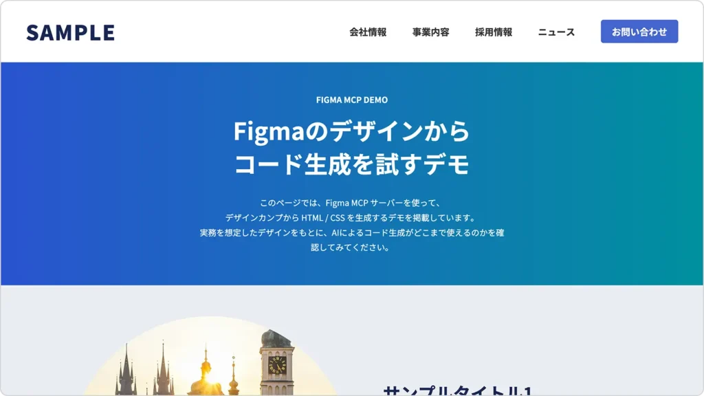
ここまでの手順で生成したコードをもとに、検証②のデモページを用意しました。実際のブラウザ表示でどうなっているかを確認できます。
ここからは、検証②(段階的生成)によって最終的に出力されたコード全体を見ていきます。
まずはHTMLです。検証①と比べると、PC / スマホでDOMを分けず、単一構造で組み立てられている点が確認できます。
<!DOCTYPE html>
<html lang="ja">
<head>
  <meta charset="UTF-8">
  <meta name="viewport" content="width=device-width, initial-scale=1.0">
  <title>SAMPLE</title>
  <link rel="preconnect" href="https://fonts.googleapis.com">
  <link rel="preconnect" href="https://fonts.gstatic.com" crossorigin>
  <link href="https://fonts.googleapis.com/css2?family=Noto+Sans+JP:wght@400;500;700;900&display=swap" rel="stylesheet">
</head>
<body>
  <header class="header">
    <h1 class="header__logo">SAMPLE</h1>

    <div class="header__nav-wrapper">
      <nav class="header__nav">
        <a href="#" class="header__nav-item">会社情報</a>
        <a href="#" class="header__nav-item">事業内容</a>
        <a href="#" class="header__nav-item">採用情報</a>
        <a href="#" class="header__nav-item">ニュース</a>
      </nav>
      <a href="#" class="header__button">お問い合わせ</a>
    </div>
  </header>

  <main class="main">
    <section class="hero">
      <div class="hero__inner">
        <div class="hero__header">
          <p class="hero__label">FIGMA MCP DEMO</p>
          <h1 class="hero__title">
            <span>Figmaのデザインから</span>
            <span>コード生成を試すデモ</span>
          </h1>
        </div>
        <div class="hero__description">
          <p>このページでは、Figma MCP サーバーを使って、</p>
          <p>デザインカンプから HTML / CSS を生成するデモを掲載しています。</p>
          <p>実務を想定したデザインをもとに、AIによるコード生成がどこまで使えるのかを確認してみてください。</p>
        </div>
      </div>
    </section>

    <section class="content">
      <div class="content__list">
        <article class="content__item">
          <div class="content__image">
            <img src="pic_5138_demo01.webp" alt="">
          </div>
          <div class="content__text">
            <h2 class="content__title">サンプルタイトル1</h2>
            <div class="content__body">
              <p>Figma MCP を使うことで、デザインとコーディングの間にある作業を効率化できます。特に、レイアウト構造や余白、文字サイズといった基本設計を把握する用途では、初動の実装スピードを大きく縮めることができます。</p>
              <p>一方で、すべてを自動化できるわけではなく、生成されたコードをどのように使い、どう手直しするかが重要になります。</p>
            </div>
          </div>
        </article>

        <article class="content__item content__item--reverse">
          <div class="content__image">
            <img src="pic_5138_demo02.webp" alt="">
          </div>
          <div class="content__text">
            <h2 class="content__title">サンプルタイトル2</h2>
            <div class="content__body">
              <p>Figma MCP を使うことで、デザインとコーディングの間にある作業を効率化できます。特に、レイアウト構造や余白、文字サイズといった基本設計を把握する用途では、初動の実装スピードを大きく縮めることができます。</p>
              <p>一方で、すべてを自動化できるわけではなく、生成されたコードをどのように使い、どう手直しするかが重要になります。</p>
            </div>
          </div>
        </article>

        <article class="content__item">
          <div class="content__image">
            <img src="pic_5138_demo03.webp" alt="">
          </div>
          <div class="content__text">
            <h2 class="content__title">サンプルタイトル3</h2>
            <div class="content__body">
              <p>Figma MCP を使うことで、デザインとコーディングの間にある作業を効率化できます。特に、レイアウト構造や余白、文字サイズといった基本設計を把握する用途では、初動の実装スピードを大きく縮めることができます。</p>
              <p>一方で、すべてを自動化できるわけではなく、生成されたコードをどのように使い、どう手直しするかが重要になります。</p>
            </div>
          </div>
        </article>

        <article class="content__item content__item--reverse">
          <div class="content__image">
            <img src="pic_5138_demo04.webp" alt="">
          </div>
          <div class="content__text">
            <h2 class="content__title">サンプルタイトル4</h2>
            <div class="content__body">
              <p>Figma MCP を使うことで、デザインとコーディングの間にある作業を効率化できます。特に、レイアウト構造や余白、文字サイズといった基本設計を把握する用途では、初動の実装スピードを大きく縮めることができます。</p>
              <p>一方で、すべてを自動化できるわけではなく、生成されたコードをどのように使い、どう手直しするかが重要になります。</p>
            </div>
          </div>
        </article>
      </div>
    </section>

    <section class="related">
      <p class="related__description">
        このページは以下の記事のデモです。<br>
        デモの使い方や詳細な解説は、記事内でご覧いただけます。
      </p>

      <a href="#" class="related__card">
        <div class="related__image">
          <img src="pic_eyecatch1228-320x180.webp" alt="">
        </div>
        <div class="related__text">
          <p class="related__title">
            CSSで複雑な形も簡単設定!<br>
            実務でも使えるclip-pathの基本形状と応用例を紹介
          </p>
        </div>
        <div class="related__arrow">
          <img src="icon_5138_demo01.svg" alt="">
        </div>
      </a>
    </section>
  </main>

  <footer class="footer">
    <p class="footer__copyright">©フロントエンドクリップ</p>
  </footer>
</body>
</html>
続いてCSSです。スケルトンで定義した共通ベースを土台に、各パーツごとのスタイルが段階的に追加されています。
/* ============================================
  共通ベーススタイル
  ============================================ */

/* リセット・基本設定 */
* {
  box-sizing: border-box;
  margin: 0;
  padding: 0;
}

/* フォント読み込み */
body {
  font-family: 'Noto Sans JP', sans-serif;
  font-weight: 400;
  line-height: 1.6;
  color: #333;
  background-color: #e9edf2;
}

/* 画像・リンク・リストのベース */
img {
  max-width: 100%;
  height: auto;
  display: block;
}

a {
  color: inherit;
  text-decoration: none;
}

ul, ol {
  list-style: none;
}

/* ============================================
  コンテナ・レイアウト
  ============================================ */

.container {
  max-width: 1100px;
  margin: 0 auto;
  padding-inline: 20px;
}

/* ============================================
  セクション共通の余白
  ============================================ */

section {
  padding-block: 60px;
}

/* ============================================
  Header
  ============================================ */

.header {
  background-color: #fff;
}

.header__logo {
  font-family: 'Noto Sans JP', sans-serif;
  font-weight: 900;
  color: #192753;
  margin: 0;
  line-height: normal;
}

.header__nav-wrapper {
  display: flex;
  align-items: center;
  gap: 50px;
}

.header__nav {
  display: flex;
  align-items: center;
  gap: 50px;
}

.header__nav-item {
  font-family: 'Noto Sans JP', sans-serif;
  font-weight: 700;
  font-size: 18px;
  color: #333;
  line-height: normal;
}

.header__button {
  display: flex;
  align-items: center;
  justify-content: center;
  width: 150px;
  height: 45px;
  background-color: #4466ce;
  border-radius: 5px;
  font-family: 'Noto Sans JP', sans-serif;
  font-weight: 700;
  font-size: 18px;
  color: #fff;
  text-align: center;
  line-height: normal;
}

@media (max-width: 767px) {
  .header {
    height: 80px;
    padding: 36px 20px;
    display: flex;
    align-items: center;
  }

  .header__logo {
    font-size: 25px;
    letter-spacing: 1px;
    margin: 0 auto;
  }

  .header__nav-wrapper {
    display: none;
  }
}

@media (min-width: 768px) {
  .header {
    height: 120px;
    padding: 36px 50px;
    display: flex;
    align-items: center;
    justify-content: space-between;
  }

  .header__logo {
    font-size: 40px;
    letter-spacing: 2px;
  }
}

.main {
  /* placeholder - 個別スタイルは後から追加 */
}

/* ============================================
  Hero
  ============================================ */

.hero {
  background: linear-gradient(to right, #2a53d0, #00909e);
  color: #fff;
  display: flex;
  flex-direction: column;
  align-items: center;
  justify-content: center;
}

.hero__inner {
  display: flex;
  flex-direction: column;
  align-items: center;
  gap: 30px;
  width: 100%;
}

.hero__header {
  display: flex;
  flex-direction: column;
  align-items: center;
  gap: 15px;
}

.hero__label {
  font-family: 'Noto Sans JP', sans-serif;
  font-weight: 700;
  line-height: normal;
  margin: 0;
}

.hero__title {
  font-family: 'Noto Sans JP', sans-serif;
  font-weight: 700;
  line-height: 1.4;
  margin: 0;
  display: flex;
  flex-direction: column;
}

.hero__title span {
  display: block;
}

.hero__description {
  font-family: 'Noto Sans JP', sans-serif;
  font-weight: 400;
  line-height: 1.8;
  text-align: center;
}

.hero__description p {
  margin: 0;
}

.hero__description p:not(:last-child) {
  margin-bottom: 0;
}

@media (max-width: 767px) {
  .hero {
    padding: 60px 20px;
  }

  .hero__header {
    gap: 10px;
    text-align: center;
  }

  .hero__label {
    font-size: 14px;
  }

  .hero__title {
    font-size: 32px;
  }

  .hero__description {
    font-size: 14px;
  }
}

@media (min-width: 768px) {
  .hero {
    min-height: 400px;
    padding: 60px 20px;
  }

  .hero__inner {
    max-width: 606px;
    margin: 0 auto;
  }

  .hero__header {
    gap: 15px;
  }

  .hero__label {
    font-size: 16px;
  }

  .hero__title {
    font-size: 46px;
  }

  .hero__description {
    font-size: 16px;
  }
}

/* ============================================
  Content
  ============================================ */

.content__list {
  display: flex;
  flex-direction: column;
  align-items: center;
}

.content__item {
  display: flex;
  align-items: center;
  width: 100%;
}

.content__image {
  border-radius: 999px;
  overflow: hidden;
  flex-shrink: 0;
}

.content__image img {
  width: 100%;
  height: 100%;
  object-fit: cover;
  display: block;
}

.content__text {
  display: flex;
  flex-direction: column;
}

.content__title {
  font-family: 'Noto Sans JP', sans-serif;
  font-weight: 700;
  color: #192753;
  line-height: 1.4;
  margin: 0;
}

.content__body {
  font-family: 'Noto Sans JP', sans-serif;
  font-weight: 400;
  color: #000;
  line-height: 1.8;
}

.content__body p {
  margin: 0;
}

@media (max-width: 767px) {
  .content__list {
    gap: 60px;
  }

  .content__item {
    flex-direction: column;
    gap: 30px;
  }

  .content__image {
    width: 200px;
    height: 200px;
  }

  .content__text {
    gap: 20px;
    width: 100%;
  }

  .content__title {
    font-size: 24px;
    text-align: center;
    width: 100%;
  }

  .content__body {
    font-size: 16px;
    gap: 25px;
    display: flex;
    flex-direction: column;
  }
}

@media (min-width: 768px) {
  .content__list {
    gap: 80px;
    max-width: 1100px;
    margin: 0 auto;
  }

  .content__item {
    gap: 60px;
    justify-content: center;
  }

  .content__item--reverse {
    flex-direction: row-reverse;
  }

  .content__image {
    width: 550px;
    height: 550px;
  }

  .content__text {
    gap: 45px;
    width: 490px;
  }

  .content__title {
    font-size: 34px;
    width: 100%;
  }

  .content__body {
    font-size: 16px;
    gap: 35px;
    display: flex;
    flex-direction: column;
    width: 100%;
  }
}

/* ============================================
  Related
  ============================================ */

.related__description {
  font-family: 'Noto Sans JP', sans-serif;
  font-weight: 400;
  line-height: 1.8;
  color: #333;
  margin: 0;
}

.related__card {
  background-color: #fff;
  border-radius: 5px;
  display: flex;
  align-items: center;
  text-decoration: none;
  color: inherit;
}

.related__image {
  border-radius: 5px;
  overflow: hidden;
  flex-shrink: 0;
}

.related__image img {
  width: 100%;
  height: 100%;
  object-fit: cover;
  display: block;
}

.related__text {
  flex: 1 0 0;
  min-width: 0;
}

.related__title {
  font-family: 'Noto Sans JP', sans-serif;
  font-weight: 500;
  color: #192757;
  margin: 0;
}

.related__arrow {
  flex-shrink: 0;
  display: flex;
  align-items: center;
  justify-content: center;
}

.related__arrow img {
  width: 100%;
  height: 100%;
  display: block;
}

@media (max-width: 767px) {
  .related__description {
    font-size: 16px;
    width: 100%;
  }

  .related__card {
    gap: 20px;
    padding: 15px 20px;
    width: 100%;
  }

  .related__image {
    width: 88.5px;
    height: 49.781px;
  }

  .related__title {
    font-size: 14px;
    line-height: 1.6;
    flex: 1 0 0;
    min-width: 0;
  }

  .related__arrow {
    display: none;
  }
}

@media (min-width: 768px) {
  .related {
    display: flex;
    flex-direction: column;
    align-items: center;
    gap: 35px;
  }

  .related__description {
    font-size: 16px;
    text-align: center;
    width: min-content;
  }

  .related__card {
    gap: 30px;
    padding: 30px;
    width: 740px;
  }

  .related__image {
    width: 136px;
    height: 77px;
  }

  .related__text {
    gap: 20px;
    display: flex;
    align-items: center;
  }

  .related__title {
    font-size: 16px;
    line-height: 1.8;
  }

  .related__arrow {
    width: 8.182px;
    height: 12.121px;
  }

  .related__arrow img {
    transform: rotate(90deg) scaleY(-1);
  }
}

/* ============================================
  Footer
  ============================================ */

.footer {
  background-color: #192753;
  display: flex;
  flex-direction: column;
  align-items: flex-start;
}

.footer__copyright {
  font-family: 'Noto Sans JP', sans-serif;
  font-weight: 400;
  font-size: 14px;
  line-height: normal;
  color: #fff;
  text-align: center;
  margin: 0;
  width: 100%;
}

@media (max-width: 767px) {
  .footer {
    padding: 25px 0 30px;
  }
}

@media (min-width: 768px) {
  .footer {
    padding: 30px 0;
  }
}
検証②(段階的生成)では、検証①(最小プロンプトでの一括生成)と比べて、コードの方向性そのものに、はっきりとした改善が見られました。
検証①では、PC用・スマホ用のHTMLを二重化し、display: noneで切り替える構造になっていましたが、検証②では単一DOM構成のまま、メディアクエリで切り替える形に改善されています。
その結果、PC / スマホそれぞれに同じ修正を入れる必要がなくなり、修正漏れのリスクが大きく減りました。ここが検証①からの最大の改善点です。
ヒーローエリアについて、検証①では左右余白をpaddingの固定値で調整していたため、画面幅を変えると崩れが目立つ構成でした。一方、検証②ではmax-widthで制御する構成に変わっています。
ブラウザ幅を狭めても、見出しや説明文が不自然に折り返される崩れは解消されており、見た目の安定性は明らかに改善しています。
検証②でも、説明文の改行はカンプ通りにはなっていないですね。最適とは言えませんが、検証①と比べると大きく前進と言っていいでしょう。
検証②では、交互レイアウトの実装方法が整理されています。
HTML側では要素の並び順を固定したまま、交互表示はCSSのみで制御する形に統一されており、検証①で見られた「HTMLでもCSSでも並びを操作している」状態は解消されています。
段階的にコードを生成した検証②では、検証①と比べて明確な改善が見られました。ただし、実務のベースコードとしてそのまま使えるかという観点では、まだいくつか気になる点が残っています。
HTMLの見出し構造を見ると、
h1h1として出力されており、h1が2つ存在する構成になっていました。検証①とは形は異なりますが、見出し構造に課題が残っている点は共通しています。
relatedセクションでは、PC表示時に説明文が縦へ潰れて表示される崩れが確認できます。コードを見ると、説明文に対して次の指定が入っていました。
.related__description {
  width: min-content;
}
この指定によりテキスト幅が極端に狭くなり、結果として縦に詰まった表示になっています。
とはいえ、この指定を消せば一瞬で直るレベルですね。
生成されたHTMLでは、<nav>内のナビゲーションがul / liを使わず、<a>タグをそのまま並べた構造になっていました。
<nav class="header__nav">
  <a href="#" class="header__nav-item">会社情報</a>
  <a href="#" class="header__nav-item">事業内容</a>
  <a href="#" class="header__nav-item">採用情報</a>
  <a href="#" class="header__nav-item">ニュース</a>
</nav>
ナビゲーションとして機能しないわけではありませんが、一般的なリスト構造のナビと比べると、意味構造としてはやや弱い印象です。
ここで興味深いのは、検証①ではul / liを使った一般的なナビ構造が出力されていた点です。この違いは、生成時にAIへ渡している文脈の範囲によるものと考えられます。
このことからも分かるように、ナビゲーションのような意味構造に関わる設計は、プロンプトに具体的な指示を含めるのが確実でしょう。
段階的にコードを生成する手順を取ったことで、検証①と比べて、HTML/CSSの質は明らかに改善されました。PC / スマホでDOMを分けず、単一DOMを前提にレスポンシブが組まれている点は、実務目線でも扱いやすい方向に寄っています。
一方で、見出し構造や細部のレイアウトなど、そのまま実務のベースとして使うには調整が必要な点も残っています。
総合すると、検証②は「修正前提であれば選択肢になり得るが、そのまま使える状態ではない」という評価になります。
ここまで、Figma MCPサーバーを使って、一括生成と段階的生成の2つの方法を検証してきました。同じデザイン・同じ環境で実行した結果、生成されるHTML/CSSの傾向や扱いやすさには、はっきりとした違いが見られます。
このセクションでは、検証①・②を比較して分かった点を整理したうえで、実務ではFigma MCPサーバーをどのように使うのが現実的かをまとめます。
実務でFigma MCPサーバーを使うなら、ページ全体を一括で生成するのではなく、段階的にコードを生成する使い方が現実的です。
検証①・②を振り返ると、一括生成ではHTML構造やレスポンシブ設計が不安定になりやすかったのに対し、段階的生成は構造や役割分担が比較的整理されたコードが出やすいという違いが見られました。この差は、AIに一度に渡している文脈の量によるものだと考えられます。
その結果、段階的生成のほうが、構造の整ったHTML/CSSが出力されやすくなります。
ページが長くなったり、挙動の要件が増えるほど、AIに渡す情報量は増えます。だからこそ、段階的に生成したほうが扱いやすそうですね。
検証②ではスケルトン生成もFigma MCPサーバーに任せましたが、使いどころを考えると、スケルトン部分は必ずしもAIに生成させる必要はないと感じました。
ページ全体の骨組みとなる部分は、次のような理由から、手動で用意したほうが安定しやすいケースが多いです。
スケルトンは人が作って、セクションごとのパーツ生成はAIに任せる、という役割分担も良さそうです。
使い方に慣れてくると、毎回その場でプロンプトを考えるのではなく、プロジェクトごとに使い回せる安定したプロンプトが固まってきます。案件やサイト単位で、「このデザイン・この構成なら、この指示でいける」という型を持てるようになるイメージです。
プロンプトが固まると、生成結果のブレが減り、作業時間も短縮されます。さらに、「このプロンプトなら、だいたいこういう構造で出てくる」という出力傾向が読めるようになるため、生成後の修正ポイントも見通しやすくなります。
その場限りの指示というより、案件ごとの設計メモとしてプロンプトを蓄積していくほうが現実的かもしれません。
Figma MCPサーバーによるコード生成は、プロンプトだけでなく、Figma上の構造や整理状態の影響も強く受けます。
レイヤー構造やコンポーネントの粒度が整理されていれば、生成されるHTMLも比較的素直になります。一方で、PC・スマホの関係性やセクションのまとまりが曖昧な状態では、その迷いがコード側にも表れやすくなります。
今回はあえて「よくあるカンプ」で検証しましたが、オートレイアウトやレイヤーを整理しておけば、生成精度はもっと上がりそうですね。
Figma MCPサーバーは、FigmaのデザインからHTML/CSSを生成できる便利な仕組みですが、すべてを一括で任せればそのまま実務で使える、というツールではありません。
一方で、生成範囲をコントロールし、段階的に使う前提であれば、実装の下地づくりや初動の効率化に役立つ場面は十分にあります。スケルトン設計やプロンプトを工夫することで、出力結果も安定してきます。
「どこまでをAIに任せ、どこからを人が判断するか」を意識しながら使うことが、Figma MCPサーバーと現実的に付き合っていくためのポイントと言えそうです。
押していただけると励みになります!